Jerry’s
Jerry’s – Packaging Design & Visual Refresh
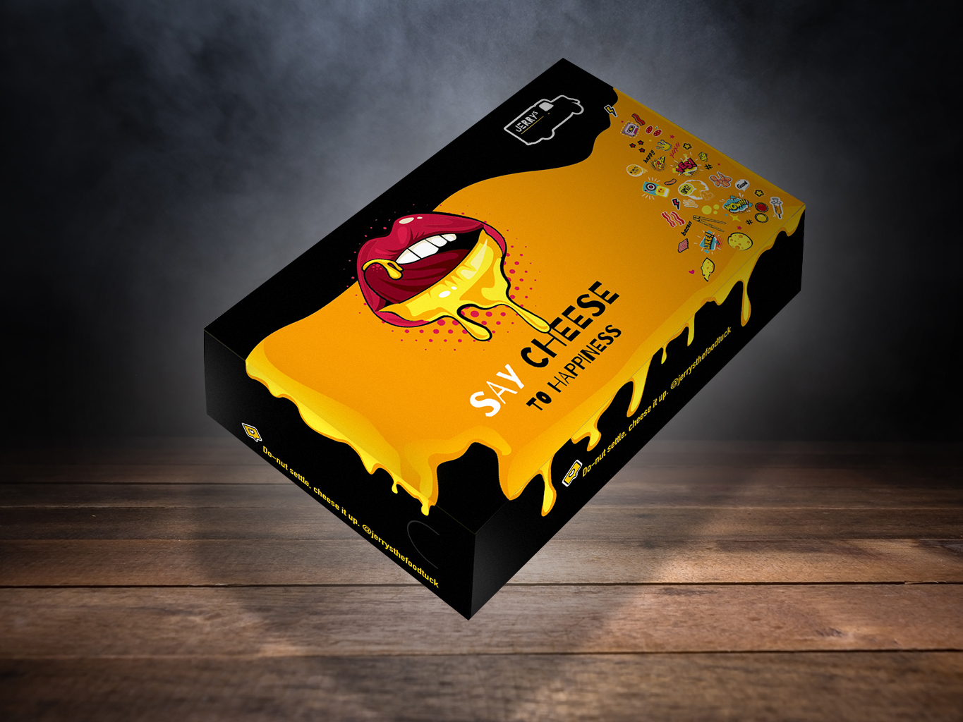
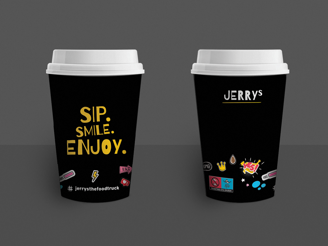
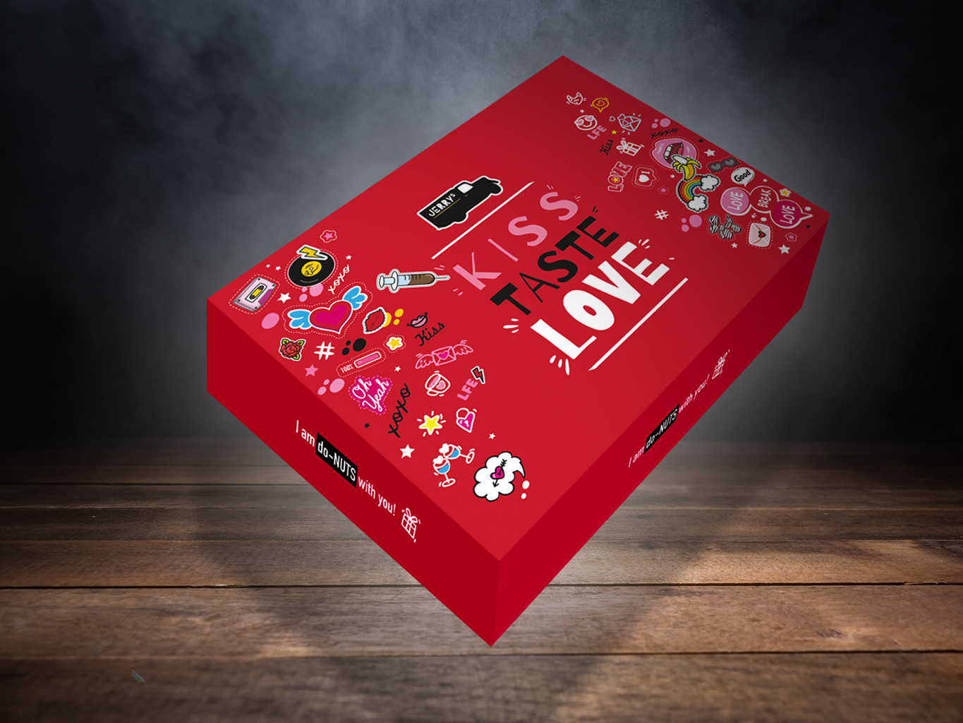
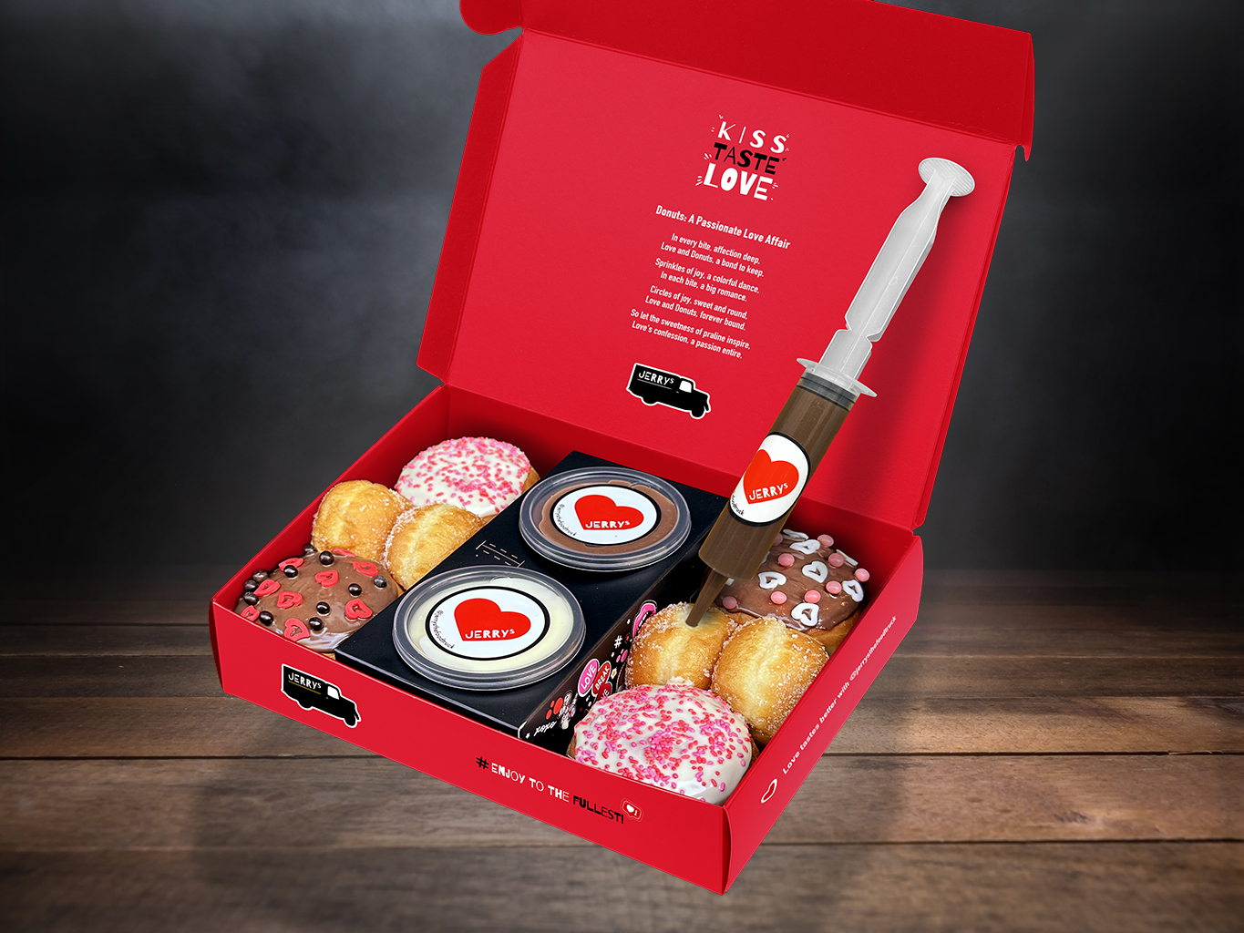
Jerry’s is a beloved food brand with an already recognizable identity. fiftyeggz was brought on board to redesign its packaging across product lines—bringing a fresh, modern feel while staying true to the brand’s familiar presence.
We developed a new visual system featuring bold typography, structured layouts, and a playful yet refined color palette that reflects the brand’s friendly, everyday personality. As part of the collaboration, we also designed Jerry’s first-ever packaging for savory products, expanding the brand’s visual language beyond its traditional sweet product range.
The result is a packaging suite that unifies the product family while opening new ground for brand growth.


